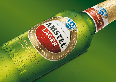
Yesterday I received a surprise from one of my favourite beers. What was this gift that had arrived at my front door I thought, what was in this box...aaahhh now I see. Amstel Lager have announced that they are launching a new look and feel to their design. It is aimed at enhancing their iconic brand appeal and all around bringing a fresh new look. The last update was back in 2007 so this is a great move by Amstel considering what other beer brands have done. Check out the great look and feel below.
Here are some quotes from the big dogs at Amstel: “Packaging is the most tangible point of contact with our consumer and the new look reflects not only the quality of our beer, but further enhances our premium nature.” says Diederik Vos, Marketing Manager Amstel Lager.
What I think
Overall I think it is lekker, the design and new packaging is great, elegant if you will. Firstly to touch on the can the golden arc gives it a very prestigious feel, personally I am a bottle (or glass) man, but the can does look a lot better then the old one. Back to the bottle, it is taller and more slender, which for some reason makes me like it more. It seems that this is the style that many beers are going, does it give it a more up market vibe?...Possibly. It has a manly feel and you can never go wrong with some good old embossing.
I am really a fan of the "Take Your Time" - it's gives you a feeling of...well taking your time to enjoy every sip of a delicious Amstel. You can watch this video below to get a better look and see what exactly has been improved upon. So overall Amstel you get a thumbs up from us.
Amstel from Just Kicking It


No comments:
Post a Comment